Click Above to Explore Live Site
Engaging minds and strengthening connections.
Nestled in the small, prestigious town of Hanover, New Hampshire, resides the much-loved Howe Library. A focal point of the community since its founding in 1900, the library prides itself on its attentive and knowledgeable staff and beautiful structure filled with nooks and crannies for facilitating both quiet contemplation and vibrant group collaborations.
When library staff realized their need for a complete website overhaul and logo refresh, they approached BI Studio as a partner to fulfill their unique and multi-faceted requirements. I was assigned the role of lead design and creative direction on the project, working hand in hand with the internal BI team, and the staff of the Howe Library to help facilitate a smooth transition from their old site to the new.

First Steps
To start, we began with the creative brief, outlining the goals, challenges, brand attributes, as well as audience personas. We also researched competitive library sites, evaluating the UX design, features, and information architecture as it related to the library’s requirements.
Even though we’ve designed numerous library websites, we still perform this fundamental research for every library site we create. This ensures that the most recent library design features and functions are considered, as it creates a uniquely distinctive site for our clients.
Testimonial Teaser Video I created to promote the Howe Library site and BI Studio’s role in the creation of the website.. I was responsible for staff interviews, videotaping, and editing of final piece.
Logo
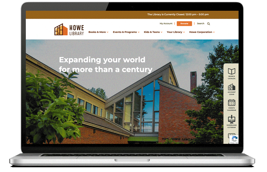
When a visitor first encounters the Howe Library, they are greeted by a magnificent space, a structure designed by premier library architects Shepley, Bulfinch, Richardson, and Young in 1973. Facilitating the surrounding landscape, an expansive array of glass, angles, and wood resoundingly leaves its mark.
When a visitor first encounters the Howe Library, they are greeted by a magnificent space, a structure designed by premier library architects Shepley, Bulfinch, Richardson, and Young in 1973. Facilitating the surrounding landscape, an expansive array of glass, angles, and wood resoundingly leaves its mark.

It was the uniqueness of this structure that facilitated a natural starting point as we began conceptualizing the redesign of their logo and subsequent brand marks.
Throughout multiple iterations, color, concept, and typography combined seamlessly with a resulting solution as striking and memorable as the building itself. A mark that works well on not only the website, but throughout all of the library’s print and electronic branding.
As a special treat, I revealed a series of proof of concepts to Pam and her team during the review, with a series of T-shirts that reinforced their final decision and left them with unmistakable smiles all around.

Row-Based Design
During the restructuring of the online presence, BI Studio utilized a fundamental Row-Based Design for the Homepage. Row-based design uses single rows to display content as opposed to columns, ensuring less distraction and clutter for the viewer. Another benefit is that the row-based design accommodates varying screen sizes, making for a more mobile-optimized site.
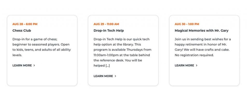
Scrolling down from the upper hero and quick-links area, the page displays an Events Row utilizing a dynamic, card-based design. This row is flexible, allowing library staff to display selected or rotational items to showcase their most recent events and aid visitors in quickly finding items of interest.
Traveling further down the page, the viewer encounters a full edge-to-edge Separator Row, with a bold visual and impactful message that can easily be swapped out when needed. In this instance, highlighting online digital resources such as the streaming content of Hoopla, Kanopy, and Libby. Many patrons are unaware of the free streaming content libraries offer, and this method has proven successful in reaching its intended audience.

No library website is complete without the use of integrated technologies for more streamlined and accessible services. The “New Arrivals” Row is no exception. In this case, The Howe Library utilizes the Evergreen ILS to dynamically display and access a variety of new books or media through several visitor-focused categories.

Capping off the home page (and shared throughout the site), BI created a pre-footer banner that reinforces the Howe Library brand and playful includes their mascot “Howe the Owl” as it utilizes an equally fun call to action of “Be Wise, Stay in the Know!” as a memorable request for subscribing to their newsletter.

Site Wide Highlights
As a result of the collaborative effort between the Howe Library staff and the BI team, a multitude of features and functions found within were implemented into the site. Those include:
- Dynamic hours display
- Blog Migration
- Mega menu for displaying secondary and third-level navigation
- ADA compliance
- Photo & video galleries
- Google Analytics & Google Search Console integration
- 301 redirects and an XML sitemap to retain search engine rankings
- Alert Bar for time-sensitive and important notifications
- Book & media carousels
- A ‘Ways to Give’ donation page
- An ‘Ask a Librarian’ feature
- Library Card Registration
- Constant Contact newsletter subscription integration
Both teams were thrilled to see the site receiving such a positive response from the Hanover community.